When Google unveiled the name Alphabet, I’ll admit that I wasn’t inspired to write anything about it. I didn’t think it was great. I didn’t think it was awful. I was curious to see what they planned to do with this middle-of-the-road name and how they’d turn it into a brand.

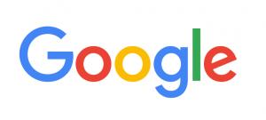
Well, I still don’t have strong feelings about the name, and I’m still curious how the Alphabet brand will grow. But Google’s new logo has piqued my interest and given us a peek at how Google and Alphabet may be evolving.
The new sans-serif look is simple, playful, fresh and youthful. It feels like it was pulled from a kindergarten classroom — perhaps a poster on the wall or a worksheet for tracing letters. Their classic primary colors contribute to the kiddo vibe. Overall, it ties in nicely not only with Alphabet’s apparent look but with its name as well. There’s a feeling of wholesomeness, of going back to basics, that is associated with the alphabet. In Google’s blog post about their logo change, they mention “the Google magic” that is now built into so much of the technology in our daily lives. Indeed; thinking of it as magic is a playful, simple, and happily youthful way of looking at what Google does. The technology itself may be more complicated than I could ever understand, but the user experience of everything Google powers is as easy as 1, 2, 3.
I’m intrigued by Google. Take me back to kindergarten. Show me how this new world works.